


Until now, PrestaShop always relied on a desktop-first responsive design strategy. Indeed, there are few use cases on mobile. But you can’t prevent users from checking their store’s back office on their mobile!
Why work on responsive design?
They were some issues that affected the user experience on mobile:
- Difficulties in accessing important store information
- Hidden content because of overlapping components
- Text readability issues
- Bugs and lack of consistency on display (e.g. not the same padding)
All of these issues make it difficult for users to use PrestaShop on mobile devices. Also, they cause a bad reputation for the PrestaShop open source project.
First steps: quick wins 💪🏻
Valentin (front-end developer), and I, Scott (product designer), had a limited bandwidth to work on this project due to others features to work on. In order to avoid breaking changes, we only scoped small fixes on the mobile version of the backoffice a.k.a. quick wins.
A quick win is a small change, that is quick and easy to implement but that has a big and visible impact for the user.
Process
Maintainers first explored PrestaShop issues about responsive design on GitHub and centralized them by creating a single Epic.
In parallel, we analyzed all back office pages on mobile version and discussed responsive strategies to mitigate problems. For each problem, a specific issue was created and added to the Epic.
The Epic was organized into 3 different categories:
- Remove components – components that aren’t important or used in mobile version
- Improvements – optimizing navigation, optimizing space, etc
- Bugs – display adjustments, broken pages, etc
What has changed?
Removing components
Some components are available on mobile version but aren’t necessarily useful during the mobile experience and become easily annoying on a small screen device.
- The “Recommended Modules and Services” button has been removed thanks of the work being done on the PrestaShop open source project. It’s not available anymore.
- The “Import” and “Export” buttons have been removed for tables because importing or exporting .csv files is useless on mobile phones because of the file system and the lack of software to process them.
- Breadcrumbs have been removed because of the limited depth of the menus.
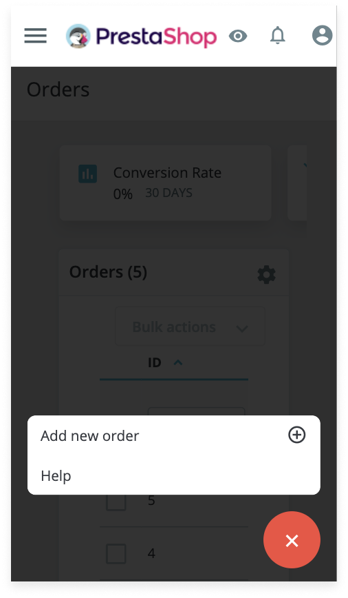
- In the header, “View my shop” text has been removed to shorten the button and save space in the header/top bar. Only the icon was kept.
- The “Merchant Expertise” button has been removed because mobile users are firstly looking for order updates from their shop. We gained some space on the top bar for more important features.
Before: «View my shop” text

After: «View my shop» text and «Merchant Expertise» button removed

Display optimization
- Some components were too close to the edges of the mobile screen, and some weren’t. In order to keep consistency, a minimum of 16 px padding left and right has been added on the mobile version.
- Font size used for the navigation drawer was too big, it was reduced. Less scroll, means more content displayed on screen and on the left menu.
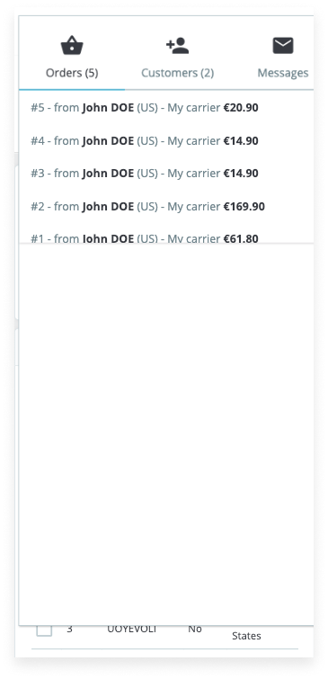
- The header and the KPIs container on the mobile version took up half of the screen space, hiding essential containers. For that reason, KPIs containers were turn into cards to optimize the space. Users can now access other KPIs cards by simply horizontally scrolling on their screen.
Feature
- According to Google Material Design’s definition: “A floating action button (FAB) represents the primary action of a screen”. Maintainers created this component exclusively on mobile version to make primary buttons easier to reach by placing it on the bottom right corner of the screen, and also to save space.
Before: less reachability for buttons and header was quite big
After: primary and secondary actions in the FAB
Navigation optimization
The accessibility and reachability issues of the navigation drawer and the header’s content have been solved on the mobile version.
- When users clicked on the hamburger menu to access the navigation drawer, the header was sticky and prevented users from viewing the first items. Users couldn’t access the Dashboard page and could barely tap on the Orders tab. The header stickiness was removed to make the menu accessible again.
Before: the header is overylaying the navigation drawer
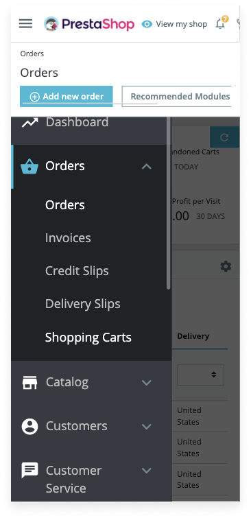
After: the header isn’t sticky anymore
- Notifications and profile weren’t accessible and it was difficult to quit the pop-in once clicked because it was almost in full page and the space to exit the pop-up was too small. The Design team redesigned the pop-in and placed it just under the selected icon to easily understand which icon the pop-in is related to. Also, a highlight was added to the selected icon to ease up identification of the selected tab. You can notice that the icon used for the profile editing button has been replaced by a more representative icon. An icon was added to the sign out link for faster identification and the use of the red color makes it stand out from the rest.
Before: difficult to quit the pop-in
After: easy to quit the notifications pop-in
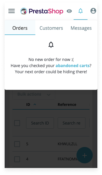
After: easy to quit the profile pop-in

Broken pages examples
A lot of pages were not displayed properly: text overlapping, making the content unreadable. Because of the lack of structure, it was also difficult to understand which group was associated with each button.
In UX, this law is called the “Law of Common Region” which stipulates that “Elements tend to be perceived into groups if they are sharing an area with a clearly defined boundary”.
- The stock management page was considered as a broken page and it was redesigned by applying the previous rules (removing import/export buttons, removing the help button, maintaining a minimum of 16 px padding left and right).
Before: stock management page completely broken

After: display fixes

What’s next? 🚀
After the quick wins, it’s time for bigger changes! Maintainers will work on more complex issues involving breaking changes such as tables.
Usability tests will be performed in order to make sure that the back office will be completely usable.
This post is also available in:
 English